How to Design the Cover Page of Your Employee Handbook
Crafting the right cover page for an employee handbook isn’t just about slapping on a logo and a title and calling it a day. The first glance sets the tone for the entire document. Your cover page offers a glimpse into the company’s culture and emphasizes the importance of the content inside.
In this article, we’ll guide you through the details of designing a memorable yet professional cover. We’ll examine the essential elements every cover should have, discuss why your cover page is important, and provide real handbook cover page examples.
By the time you’re done reading, you’ll be equipped with the knowledge to design a cover page that resonates, informs, and impresses.
Why is Your Cover Page Important?
Your cover page holds more weight than you might think. Here’s why.
It represents your company’s identity
Your cover page should directly reflect your company’s brand, identity, and culture. If your company thrives in a formal environment, your cover should echo that professionalism. On the other hand, if it’s a laid-back atmosphere, your cover should hint at that casual vibe. In essence, the cover should be a clear representation of who you are as a company.
It sets the tone
Before an employee even reads the first word of the handbook, the cover already provides clues about what they can expect inside. It prepares the reader and sets expectations. For example, a sleek, minimalist cover might suggest a straight-to-the-point, no-nonsense approach, while vibrant colors and innovative designs might hint at a more dynamic and engaging content structure.
First impressions count
We live in a world where first impressions can greatly influence perceptions, so it’s no surprise that the cover page can play a critical role in shaping the initial impression of your handbook. A carefully designed cover will attract employees, sparking curiosity and making them more likely to delve deeper. In contrast, a hastily put-together design might unintentionally signal that the content inside isn’t worth their time, even if it’s packed with invaluable information.
Bottom line is, the cover isn’t just a visual accessory. It lays the foundation for everything else, therefore it’s worth investing time and effort to get it right.
Cover Page Basics
Creating the right cover page for your employee handbook can feel challenging, but with a little more effort and the right resources, you can produce a standout cover. Remember that the ultimate goal is not to just be creative but to blend visual appeal with your company’s identity. Here are the core elements you should be considering to achieve this goal.
Include title and company logo
The title of your handbook should be more than just legible—it should resonate. Ask yourself, what message do you want to send? Choose a title, whether it’s a simple “[COMPANY_NAME] Employee Handbook/Guide” or a title containing a catchphrase unique to your company, that conveys inclusion. Place your company logo clearly in a unique way; whether it’s right in the middle like a cool sticker or tucked away in the corner, it should feel good and make people think of you.
Actually, it doesn’t even have to be your official logo. It’s okay to be a little cheeky, use an inside joke, a fun version of your logo, or an alternative illustration that is quirky yet distinctive of your company culture.
Incorporate branding into the design
Branding (i.e. company logos, colors, fonts) is a nuanced way to reflect your company’s values. Your color choices and fonts, whether formal, playful, or modern, subtly express your culture.
Sidenote: If you’re looking to blend all these elements seamlessly, consider paying a visit to Blissbook. We help you craft that handbook cover that is completely unique to your company.
Use high-quality images
Images aren’t just space fillers; they communicate, evoke emotions, and create the atmosphere. But how do you pick the right one? What moments, landscapes, or setups resonate with your company’s spirit? A lively office scene, an abstract representation of your products, or perhaps an inspiring landscape that represents growth and possibilities? For those on the lookout, platforms like Unsplash and Pexels offer an abundance of quality images. But if you’re keen on making it ultra-personalized, consider setting up a photoshoot day at the office or playing around with design tools like Canva to craft special visuals.
Experiment with different elements to capture what your company is all about in a way that looks good and feels right. Even better, chat with your marketing team to see how they would design it. Or if they’re not available, chat with Blissbook and we’ll create everything for you according to your needs and branding.
Handbook Cover Page Examples
Exploring a variety of designs can help us understand how each design connects with the company’s culture. To drive the point home, let’s walk through a variety of examples and see how each one paints a picture of the company’s culture:
Cover Page Example #1 – Rocket Whale

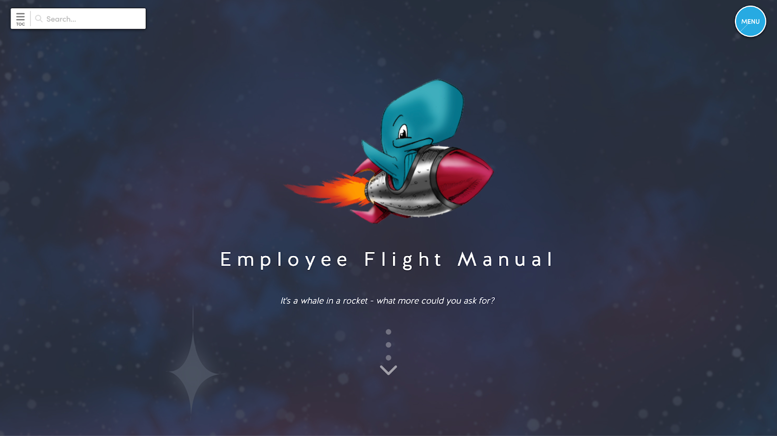
Rocket Whale, Inc.’s digital handbook, hosted on the Blissbook platform, opens with a fun and modern vibe, evident from the playful cover featuring a smiling blue whale strapped to a rocket against a starry backdrop. The cleverly titled “Employee Flight Manual” emphasizes their playful culture with the subtitle, “It’s a whale in a rocket – what more could you ask for?”
By incorporating their name into a delightful visual, and not just slapping their formal logo on there, this cover not only highlights the company’s unique handbook title but also reflects its culture, suggesting a work environment that values innovation, humor, and creativity.
Cover Page Example #2 – Slalom

The cover of Slalom’s employee handbook, titled “Love your future: Your guide to life at Slalom,” serves as an engaging and inviting introduction for new hires or existing employees looking to reacquaint themselves with company culture. The title implies a holistic approach to work life, suggesting that the company values not just the professional, but also the personal growth of its team members.
The image of smiling employees, actively engaged and collaborating in a bright and casual office environment, conveys a sense of camaraderie and positivity that is appealing to current and prospective employees. It also subtly indicates that the company prioritizes a happy and productive workspace, which can be crucial for retention and attracting talent. Overall, this cover effectively encapsulates a welcoming and supportive work atmosphere that Slalom aims to promote.
Cover Page Example #3 – Cengage

This cover for “Take the Unbeaten Path: A Trailblazer’s Guide to Cengage” reflects a commitment to growth, learning, and innovation. The choice of words like “unbeaten path” and “trailblazer” is a clear homage to exploration and leadership, positioning the reader as an innovator within the Cengage ecosystem. The design suggests a culture that values creativity and encourages employees to be pioneers in their fields. The bold colors and dynamic visuals symbolize breaking through conventional boundaries, embodying a progressive mindset that is central to Cengage’s internal branding.
Cover Page Example #4 – ZGM

Moving to a physical format, the “ZGM Employee Handbook” cover takes a fresh and funky route with bold words like ‘HUMAN’, ‘TECHNO’, and ‘CURIOUS’ splashed across it. A central blue swirl pattern resembles a fingerprint, which hints at the company’s individualistic approach. All of this gives us a feel of what the company might be all about.
The design leans towards creativity and engagement over formalities. The visual appeal will likely pique employees’ curiosity and encourage them to explore the content further.
In conclusion, these handbook covers, whether digital or printed, are more than just aesthetically pleasing; they tell their own stories and provide insights into the company’s culture.
How to Start Designing Your Cover Page
Ready to bring your employee handbook cover page to life? Here’s how to kick things off:
Lean on Your In-house Experts
If you’ve got a design team within your company, start there. They already have a solid understanding of your brand’s voice and visuals.
Organize a brainstorming session with them. Share your ideas, gather their insights, and get those creative juices flowing. They’ll be able to offer you unique perspectives and innovative ideas that might not have crossed your mind.
Your marketing crew is also important. They’ve got tips on writing and design that’ll make everything pop. They can help you name your handbook and come up with the copy for your cover page. Plus, they can give you a lowdown on the company, why the rules matter, and all the big stuff you stand for (think mission and values). Just give them a heads up, and they’ll make sure they’re ready to back you up when it’s go-time.
No in-house marketing/branding team? Let us know, we can refer some people.
Enlist External Help
If you don’t have an in-house team or seek an extra professional touch, Blissbook can help. Not only we design your cover page, we can design your whole handbook. We masterfully craft tailor-made employee handbooks that reflect your brand’s voice and vision. Curious about what we’ve done for others? Take a look at one of our top-notch designs to see how we can elevate your handbook.
Explore Design Software and Online Tools
If you can’t avoid doing this yourself, there are various design tools available on the internet, including powerful options like Adobe‘s software and user-friendly platforms like Canva. Familiarizing yourself with these tools can streamline your design tasks and ensure your cover page meets modern standards.
If you’re looking for a starting point, we’ve handpicked some employee handbook templates. They are customizable and can also inspire your own designs.
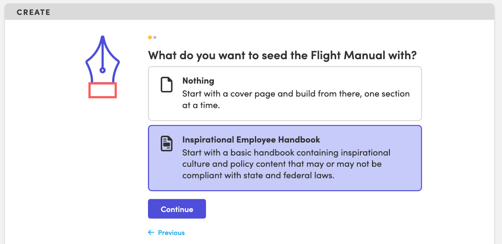
Once you sign up for Blissbook, you have automatic access to Blissbook’s Inspirational Employee Handbook template which you can customize to your organization’s needs. Alternatively, Blissbook’s content and design crew can manage the entire process, from start to finish.

Final Thoughts
In this article, we began by appreciating the importance of your employee handbook cover page and then explored the components and process, from using internal resources to considering third-party expertise like Blissbook.
Design the cover page of your employee handbook not only to check off another task on your to-do list, but to make a great first impression. Remember, a compelling cover sets the tone, engages employees, and ensures everyone is aligned with what you, as a company, are all about.
Approach your design task, whether starting anew or refreshing an existing design, with intention and purpose. Blissbook provides a cohesive solution for efficient handbook design and management. Request a demo now and chat with us to see how it can simplify your handbook creation.