7 Common Employee Handbook Design Fails (and How to Fix Them for Good)
Your employee handbook is one of the most important tools your company has. It sets expectations, explains benefits, supports compliance, and helps new hires feel at home. While some organizations see it as a simple checkbox for signatures, others recognize it as a chance to genuinely connect with employees, and design plays a big part in making that happen.
After all the work you’ve put into getting the content right, it’s worth making sure people actually want to engage with it. Poor formatting, dense text, or clunky layouts can quietly get in the way of clarity, trust, and usefulness.
But when the design is thoughtful and aligned with your culture, your handbook becomes something more: a tool that unites your team, reinforces your values, and supports real understanding. That’s the thinking behind the psychology of Blissbook, where design based on the insights of behavioral economics makes handbooks more effective and human.
Design isn’t just about fonts or colors. It’s about accessibility, readability, and how well your policies connect with people. A well-designed handbook invites engagement and makes the information inside easier to absorb.
In the sections that follow, we’ll look at seven of the most common employee handbook design fails and how to fix them. Whether you’re building a handbook from scratch or refreshing your current one, these tips will help you turn a static document into a branded, engaging resource your team will actually want to use.
Fail #1: Wall of Text Syndrome
Nothing sends readers running faster than a dense block of text. If your handbook looks more like a legal contract than an employee resource, chances are your team’s skimming or skipping it entirely.
This happens when content gets lifted straight from legal templates or policy manuals, often out of fear that trimming things down will leave something important out. The intention is good: cover your bases. But the result is a handbook that’s hard to read, harder to absorb, and almost impossible to engage with.
Some policies will run long, and that’s okay. In those cases, Blissbook’s read-more buttons are a game-changer. They let you tuck the extra detail behind a simple toggle, so readers can expand it if they want to dive deeper without overwhelming everyone else.
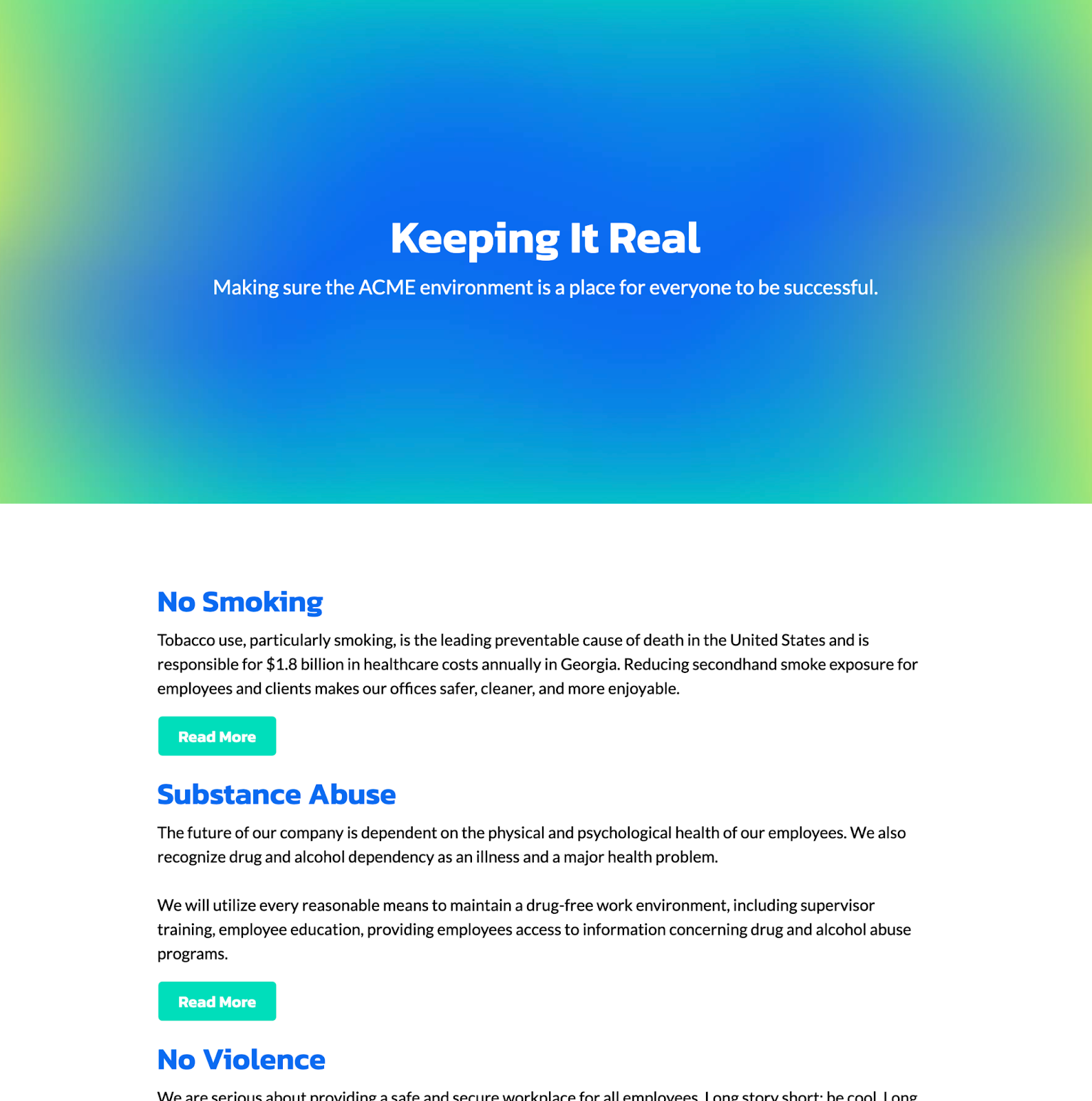
You can also break up heavy text by adding visuals. Even one well-placed photo or image inside a long policy can give readers a moment of relief and make the experience more inviting. These small design choices go a long way in turning your handbook from a chore into a resource.
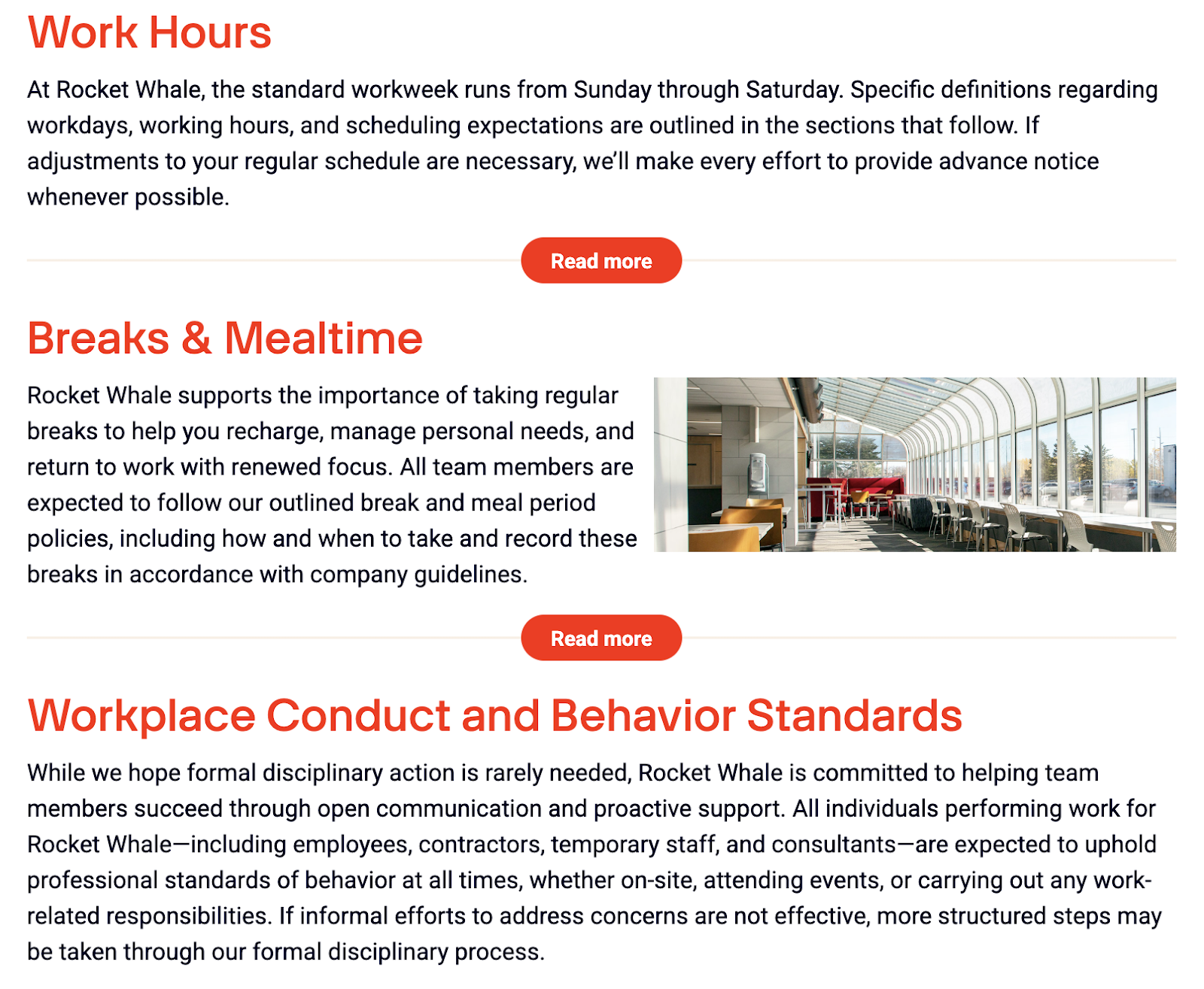
The goal isn’t to remove important info. It’s to make sure people actually see it and want to come back to it.
Fail #2: Inconsistent Branding
Imagine your new hire’s first impression of your company is an outdated, off-brand PDF with clip art and Times New Roman text. Not exactly the welcoming experience your new employee wants to have.
When your employee handbook doesn’t match the rest of your company’s brand (visually or tonally) it sends mixed signals. Employees may question how current or trustworthy the content is, even if the policies themselves are solid. It also creates a disconnect between your internal culture and the employer brand you’ve worked hard to build.
Design is part of the message
Branding isn’t just a marketing thing. It’s a trust thing. A handbook that feels aligned with your company’s visual and verbal identity builds credibility, reinforces values, and makes people feel like they’re in the right place.
This means using your company’s colors, fonts, logo, icons, photos, and tone of voice consistently. The handbook shouldn’t feel like it was written by legal and designed by someone who’s never seen your website. It should look and sound like it belongs.
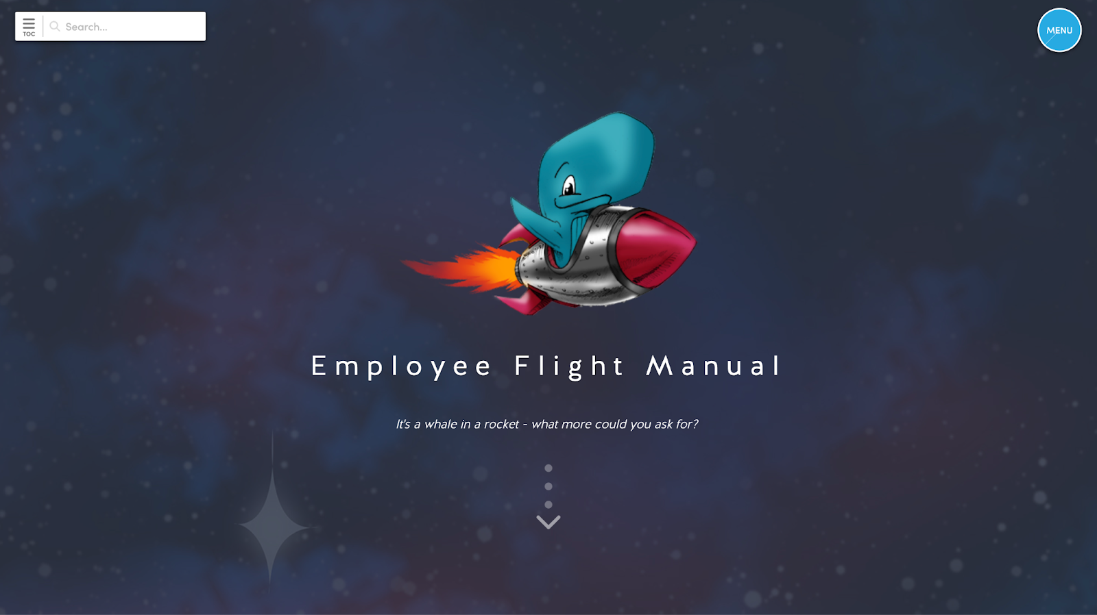
You don’t need to go overboard with design elements. Just make sure the experience feels intentional and consistent with everything else your employees interact with. Add a branded cover with your logo and company name, include a few background images that reflect your culture, and use your brand colors to bring the layout to life. Now it feels like an extension of your company, not just another off-the-shelf policy doc.
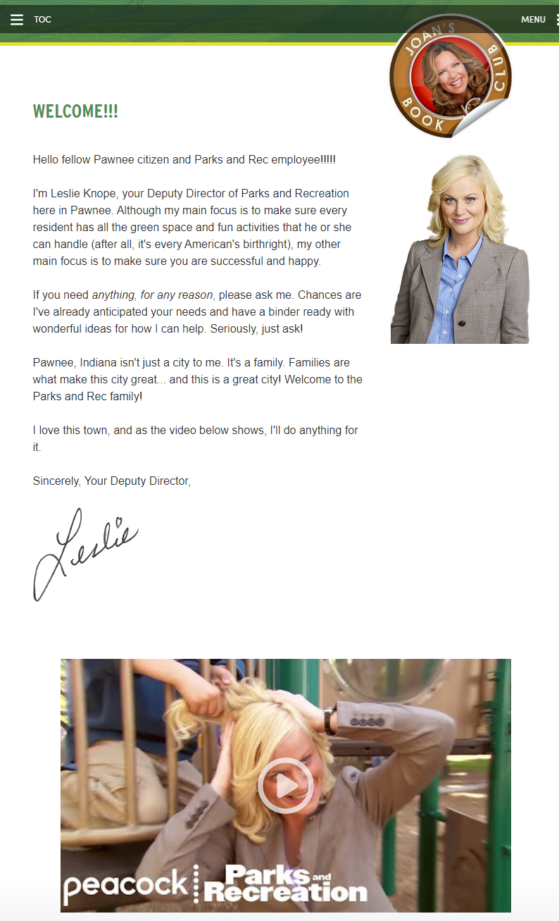
Want to reinforce your culture from the start? A welcome video from your CEO or founder can give your handbook a human voice and instantly align it with your brand’s tone and values.
Fail #3: PDF Overload
The classic PDF handbook might feel safe and familiar, but it’s not doing your team or your policies any favors.
Static PDFs are hard to update, difficult to navigate, and a pain to read on mobile. Search functionality is limited. Accessibility is often an afterthought. And once a file is downloaded, you have no control over which version someone is referencing.
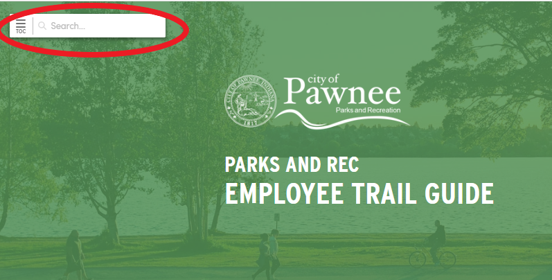
This format also puts a burden on HR teams. Updating a single policy means re-exporting the entire file, notifying employees manually, and hoping they remember where they saved it. That’s a lot of friction for something that should be simple.
A better way to deliver policies
Digital-first handbooks offer a much better experience. They’re searchable, responsive, and always up to date. Employees can find what they need fast, whether they’re on a laptop or checking a policy from their phone at the airport.
Blissbook takes it even further with interactive, branded handbooks that look great, reflect your company’s identity, and make updates a breeze. You can push changes instantly, track acknowledgments, and guide people through the content in a way that actually makes sense.
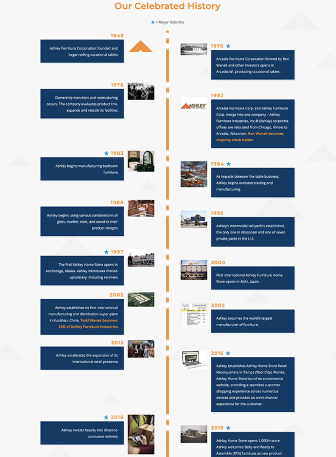
A digital-first handbook also lets you add interactive elements. For example, use a timeline to walk new hires through what their first six months might look like, or showcase your company’s backstory, growth, or major milestones. These small touches help make the handbook more engaging, personal, and memorable.
Fail #4: No Visual Hierarchy
When every part of your handbook looks the same, nothing stands out. Headers blend in with body text, links get lost, and employees are left digging for information instead of skimming with confidence.
This lack of structure overwhelms readers and makes even the best content feel disorganized. People naturally scan for cues that tell them what’s important, what’s connected, and where to focus next. If the design doesn’t offer those cues, your message gets buried.
Visual hierarchy is what guides the eye through a page and a handbook. Use consistent heading styles, vary font sizes, and keep layouts predictable. Consider organizing your content with clear chapter headers and logical groupings. For example, put all of your culture-related content up front, or start the handbook with a section on purpose and values to help employees understand the “why” behind your policies.
You can also highlight must-know details or FAQs using callouts, icons, or colored boxes. These small design touches help readers quickly spot key points and make your content more inviting.
When employees can instantly tell what to read and where to find it, your handbook becomes a helpful tool, not a chore.
Fail #5: Confusing Navigation
If employees can’t quickly find what they’re looking for, they won’t keep looking. They’ll ask HR. Again. And again.
Confusing navigation is a silent productivity killer. It shows up in handbooks with poor or nonexistent tables of contents, no internal links, and clunky layouts that force people to scroll endlessly just to get to a simple policy. Even the best content loses value if it’s buried or hard to access.
Clear organization saves everyone time. Group policies into logical categories, and use links to connect related content. Make sure the handbook is searchable so employees can type in a term and go straight to the answer, instead of guessing where it might be.
Blissbook’s built-in table of contents makes this simple. Employees can quickly scan chapter titles and jump directly to the policy they need with one click. It’s clean, intuitive, and puts everything at their fingertips. No guessing, no scrolling, no confusion. And even better navigation features, such as collapsible chapters, are on the way soon.
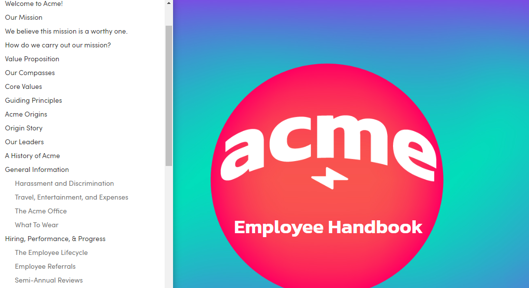
The easier it is to navigate, the more useful your handbook becomes, and the less time HR spends pointing people to things they should be able to find on their own.
Fail #6: Ignoring Accessibility
Accessibility isn’t just a nice-to-have. It’s a reflection of your company’s values and for some organizations, it may even be a legal requirement.
When your handbook uses small fonts, poor contrast, or images without alt text, it creates barriers. Some employees may struggle to read it. Others may not be able to use it at all. And if someone can’t access a policy, it’s as if the policy doesn’t exist.
Designing for accessibility means making sure everyone, regardless of ability, can read, navigate, and understand your content. That includes using readable font sizes, ensuring strong color contrast, writing clear link text, and adding alt text to images.
A good starting point is the Web Content Accessibility Guidelines (WCAG), which outline how to make digital content more usable for everyone. At Blissbook, our platform is benchmarked against WCAG 2.2 standards at Levels A, AA, and AAA, and you can explore our full accessibility statement here.
When accessibility is built in from the start, your handbook becomes more inclusive, easier to use, and better for everyone. No matter how they access it.
Fail #7: Too Serious, Too Stiff
If your handbook reads like it was written by a law firm in 1994, chances are your employees are tuning out. Long sentences, formal jargon, and a tone that sounds more like a warning than a welcome? That doesn’t inspire trust. It creates distance.
Yes, your handbook needs to reflect your company’s policies and compliance obligations. But that doesn’t mean it should sound like the law itself. Your handbook exists to communicate how your business operates and complies with the law, not to copy and paste legal text word for word. The goal is to make policies understandable and accessible to everyone.
Use plain language. Choose a tone that matches how your company already communicates, whether that’s through onboarding materials, Slack, or team meetings. This makes the content easier to digest, more relatable, and much more likely to be remembered.
If you’re wondering where that line is between legal accuracy and human readability, we break it down in more detail in this article on the difference between employee handbooks and the law.
When your handbook speaks like a real person, employees are more likely to read it, trust it, and use it. You don’t have to choose between being compliant and being clear. You can (and should) be both.
Final Thoughts
A well-written handbook can fulfill compliance requirements, but that’s only part of the picture. If the goal is to help employees truly understand your policies and feel connected to your company, how the handbook looks and feels matters just as much as what it says.
Thoughtful design turns the handbook from a formal requirement into a useful resource. It invites people in. It makes policies easier to find, easier to read, and easier to trust.
Let’s recap. Common design pitfalls like dense text, inconsistent branding, clunky PDFs, poor navigation, and lack of accessibility can quietly derail even the best content. Add a stiff, overly formal tone, and engagement drops even further.
The good news? Every one of these issues is fixable. Whether you’re building a new handbook or refreshing an old one, now’s the perfect time to rethink your format and improve how your policies are delivered.
Blissbook helps make that happen. With interactive, branded, and compliant handbooks, you can create a modern employee experience that’s easy to navigate, engaging to read, and always up to date. If you’re ready to build a handbook people will actually use, request a demo today and see what’s possible.