10 Signs Your Employees Haven’t Read Their Handbook (and What to Do About It)
You did the work. You reviewed policies, aligned with legal, cleaned up outdated language, maybe even refreshed the design. You rolled out the updated employee handbook with a clear announcement. Everyone acknowledged it. Well, almost everyone.
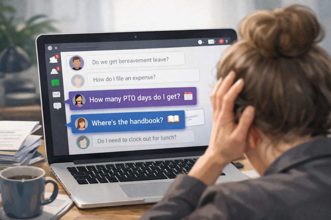
And then the questions started:
- “Wait, how many PTO days do we get?”
- “Are we allowed to work remotely on Fridays?”
- “That was a policy? I didn’t know that.”
If that feels familiar, you’re not alone. Many HR teams pour serious time and effort into creating thoughtful, compliant handbooks, only to discover that employees aren’t actually using them. When employees aren’t reading the handbook, the issue isn’t laziness or resistance, it’s friction.
Maybe the document is hard to access. Maybe it feels overwhelming. Maybe it’s technically accurate but not especially engaging. Whatever the cause, low employee handbook engagement creates real risk. Confusion leads to inconsistent decisions, which can snowball into handbook compliance issues that cost time, money, and trust.
Let’s take a look at 10 clear signs your employees haven’t read your handbook, along with practical fixes for each one.