How to Design an Effective Employee Handbook
Want to craft an employee handbook that’s more than just rules? One that really speaks to your employees and showcases your company’s spirit? We’ve got you covered.
In this article, we’ll talk about how to design an effective employee handbook, including best practices and key considerations to make it informative and engaging.
Why Handbook Design is Important
Before anything else, let’s talk about why designing an employee handbook the right way is so important. A well-designed handbook can change employees’ attitude about their employment relationship. Let’s say you’re starting a new job and are given a big, boring book full of all the ways you can be fired. Would you want to read it? Probably not.
Now what if that same handbook was interactive and engaging, with on-brand visuals, bold layouts to illustrate your company’s whys, and accessible ways to explore detailed content? Instead of thinking about how you’re entering into an adversarial, transactional relationship with your employer, you might think, “I’m joining a team on a mission, and they actually care about me!” An employee who thinks this way is less likely to create conflict.
Strategic design helps strengthen the employer-employee relationship in several ways.
- Points Out the Big Stuff: Efficient design isn’t just about looking good; it also draws attention to important information. Think of it like using a highlighter. Visual elements like infographics and flowcharts can simplify complex data, making it more digestible.
- Gives a Peek into Company Culture: Your handbook can show what the company’s culture is all about. Fun pictures from team events or images that show off the company’s vibe can make a new person feel right at home from day one.
- Makes for Easier Understanding: People process information differently. Some need to read things, while others gravitate towards visuals. A well-designed handbook helps everyone understand the content, no matter their learning style. After all, your goal is for employees to comprehend what’s in your handbook.
- Reduces Risk: When these parts come together, it results in improved employee engagement and compliance. An engaged employee, who feels valued and understands their role within the bigger company picture, is more likely to be compliant and proactive. Design can bridge the gap between mere content consumption and a true understanding, leading to a smoother and more productive work environment.

Who Should Design Your Handbook?
When you’re working on a text-heavy document like an employee handbook, a big part of the design process centers around how you organize your content. Typically, the HR department takes the helm in developing the table of contents and corresponding text sections. Generally speaking, your handbook should follow this basic structure:
- Cover page
- Welcome statement or CEO message
- Mission, vision, values, etc., which we discuss in our How To Write a Culture-First Employee Handbook eBook
- About the company, leadership/employee profiles, company history, timeline, etc., also detailed in our How To Write a Culture-First Employee Handbook eBook
- Segue from cultural content into policies, such as:
- Because we believe X, Y, and Z…,
- As we pursue our mission…, or
- We have some guidelines for how we work together…
- Policies, broken into chapters, ordered from most interesting and popular policies to least
- Legal disclaimer, if necessary (unless you’re in South Carolina, it does not need to go at the beginning)
- Optional “Thanks for reading” outro, which looks great with a big photo or graphical finish
Deciding how best to present your content should be a collaborative effort. By incorporating different teams and points of view, you provide a more well-rounded document that’s more likely to resonate with employees across the organization. Consider enlisting these people to help take your handbook to the next level.
Internal Marketing and Design Team
Your company’s design, marketing, and/or internal comms teams can play an important role in enhancing the handbook’s visual appeal and readability, so be sure to involve them in the process.
Challenge your designers to come up with innovative ways to rework long paragraphs or dense text. They might suggest visual elements that can replace lengthy explanations or pinpoint sections they find dull or confusing. They’re not just there to critique but to elevate the handbook’s design, transforming it into an attractive document that employees want to read.
Additionally, if you collaborated with a copywriter during the creation phase, that’s a bonus. They can help spruce up headlines to reflect your company’s spirit while catching the reader’s eye.
So, while HR lays the foundation, input from different departments turns this tool into something more than an HR document.
Your Handbook Vendor
If you’re working with a software vendor, see if they have a design team who can help. For example, Blissbook offers design as a service. And, because our designers are handbook experts who know the ins and outs of our platform, they can work much faster than most marketing departments. If you send your content and brand guidelines, we’ll do the heavy lifting — and provide training for future updates.
Templates
If you don’t have an in-house resource, consider using a basic template. There are many templates available on the internet that leverage design elements to increase visual appeal. These templates are crafted in a way that makes content more approachable and engaging.
Blissbook offers many ways to brand and customize the most popular types of employee handbook content — like the elements that celebrate your company’s culture. This makes your handbook look and feel completely custom, which shows employees you care and delivers a premium onboarding experience.
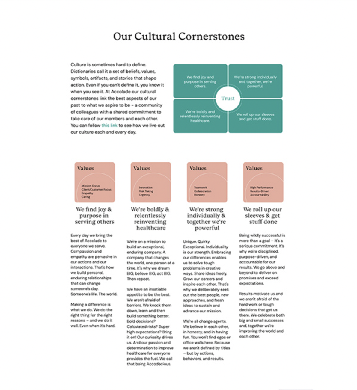
Here’s an example of how to spotlight company values and guiding principles:

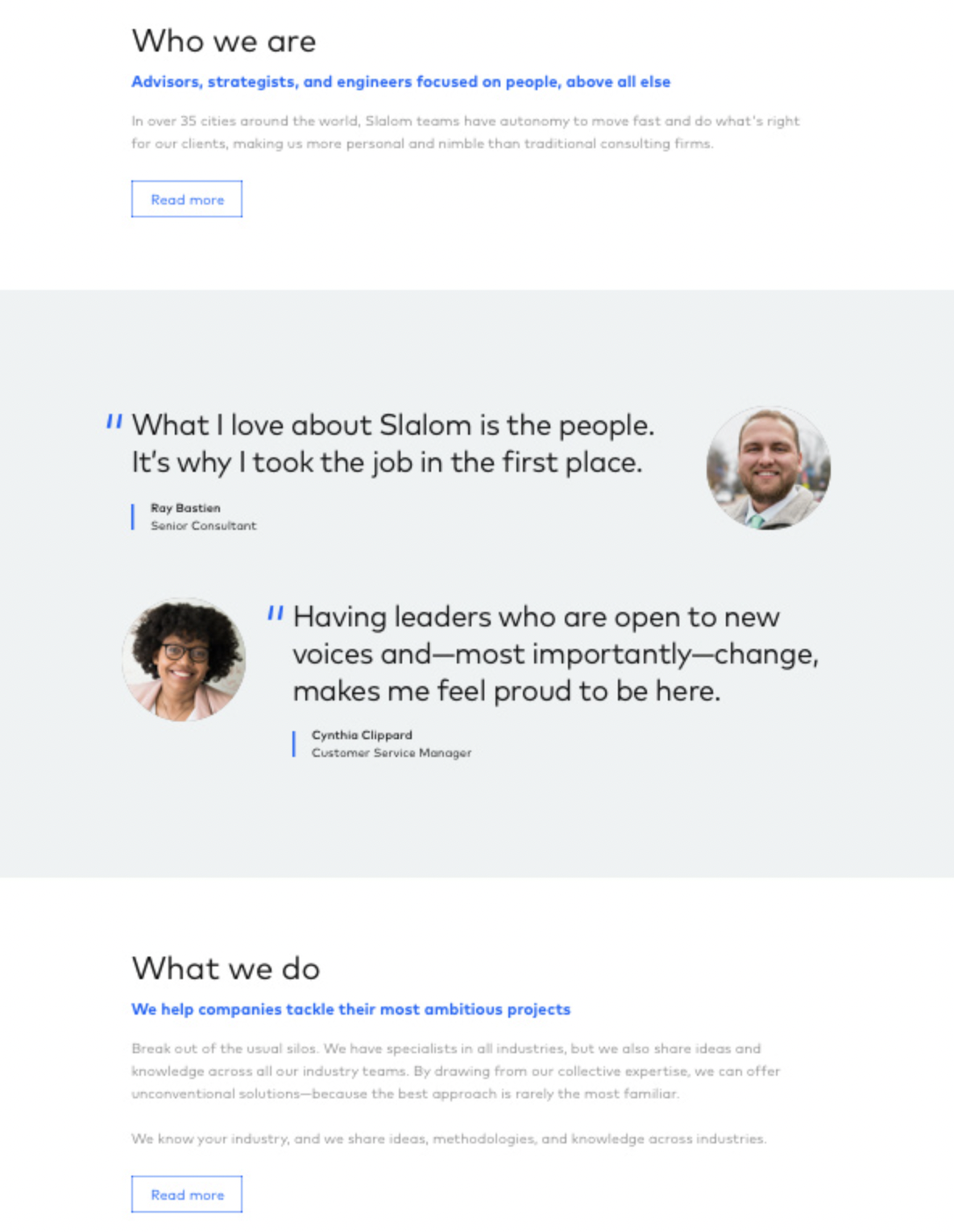
Here’s a neat way to feature employees:

In a nutshell, many templates prioritize aesthetics while also making sure that design serves its primary purpose: clear communication of your most important information. Depending on your company’s needs and preferences, you can find a template that emphasizes both visual appeal and/or content clarity.
Visual Elements to Include in Your Handbook
When crafting your employee handbook, adding the right pictures and visuals can turn a boring document into something your employees want to read. A handbook that’s user-friendly and branded makes employees feel more valued. When employees recognize you’ve gone to great lengths to provide a positive handbook experience, they’re often appreciative — and this gratitude often leads to reciprocity.
For example, if it’s clear you’ve gone above and beyond to make your handbook a pleasant read, your employees are more likely to (1) take a closer look at its content, (2) trust that it’s written with their best interest in mind, and (3) even have a better overall view of your company, minimizing potential legal conflict.
Using visuals isn’t just about making things look good. It’s about talking to your team in a way they understand and enjoy — and reinforcing your company culture and values.
Consider using these visual elements in your handbook.
Photographs
Photos provide an authentic snapshot of your company’s culture and its people. Use images from company events, candid shots of employees at work, and snapshots of office spaces, like meeting rooms, the outside of your office building, or recreational areas. These images make your handbook feel more relatable and showcase the vibrancy of your company culture.
We’ve got more tips about where to find images later in this article.
Pro Tip: Add People Profiles
Many handbooks include leadership profiles with boring bios that you’d find on LinkedIn or an investor page. We suggest you ditch the formality and make it fun and personal, as being vulnerable increases trust. Here are some ways to do this:
- Share nicknames or the fun fact that someone was once a chess champ.
- Talk about a quirk or hobby that might raise eyebrows.
- Share something the person is not good at or comfortable with.
- It doesn’t have to be just the top bosses either. You can put all kinds of employee profiles in your handbook, like board members, team leaders, frontline employees, and even the office tortoise!
By incorporating this human touch, you can build trust, show the real side of people, and make the handbook lively and engaging. Plus, it’s a good way to show everyone that, at the end of the day, we’re all human.
Illustrations and Graphics
You can turn complex ideas into approachable visuals with illustrations and graphics. Flowcharts can clarify company processes, infographics can simplify data-rich content, and icons can emphasize key points or indicate new sections or topics.
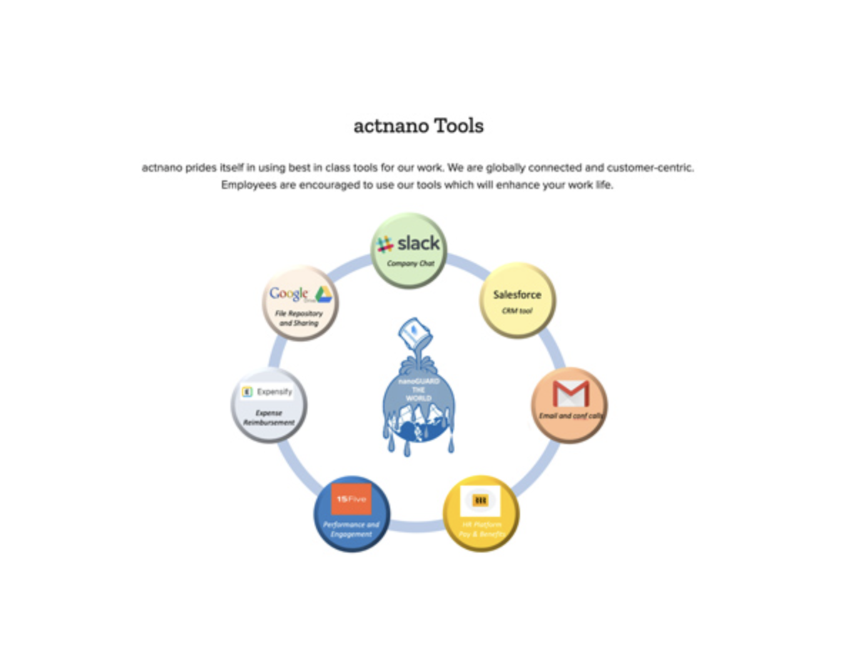
Here’s an interesting way one Blissbook client displayed the various tools its company uses:

Screenshots
For tasks that require step-by-step digital guidance, screenshots are invaluable. They can demonstrate how to use company software or guide employees through the process of completing online forms, ensuring clarity related to onboarding or reporting issues and concerns.
Diagrams
Diagrams offer structure in a visual way. For example, a diagram that outlines your organizational structure offers clarity about the company hierarchy. A diagram detailing the office layout, especially regarding safety exits and equipment, can be vital for safety training.
Pro Tip: Include a Company Timeline
Think of this as the story of your company’s journey. It can include:
- The birth of the company idea
- When new products came out
- Big moments, like hitting a sales goal or opening a new office
- And even fun stuff to keep it interesting, like the year a famous song came out or the year Skittles were introduced in the U.S. (1979, by the way)
If you’re wondering what to add, you can look through old company posts, talk to long-time employees, or dig up past achievements.
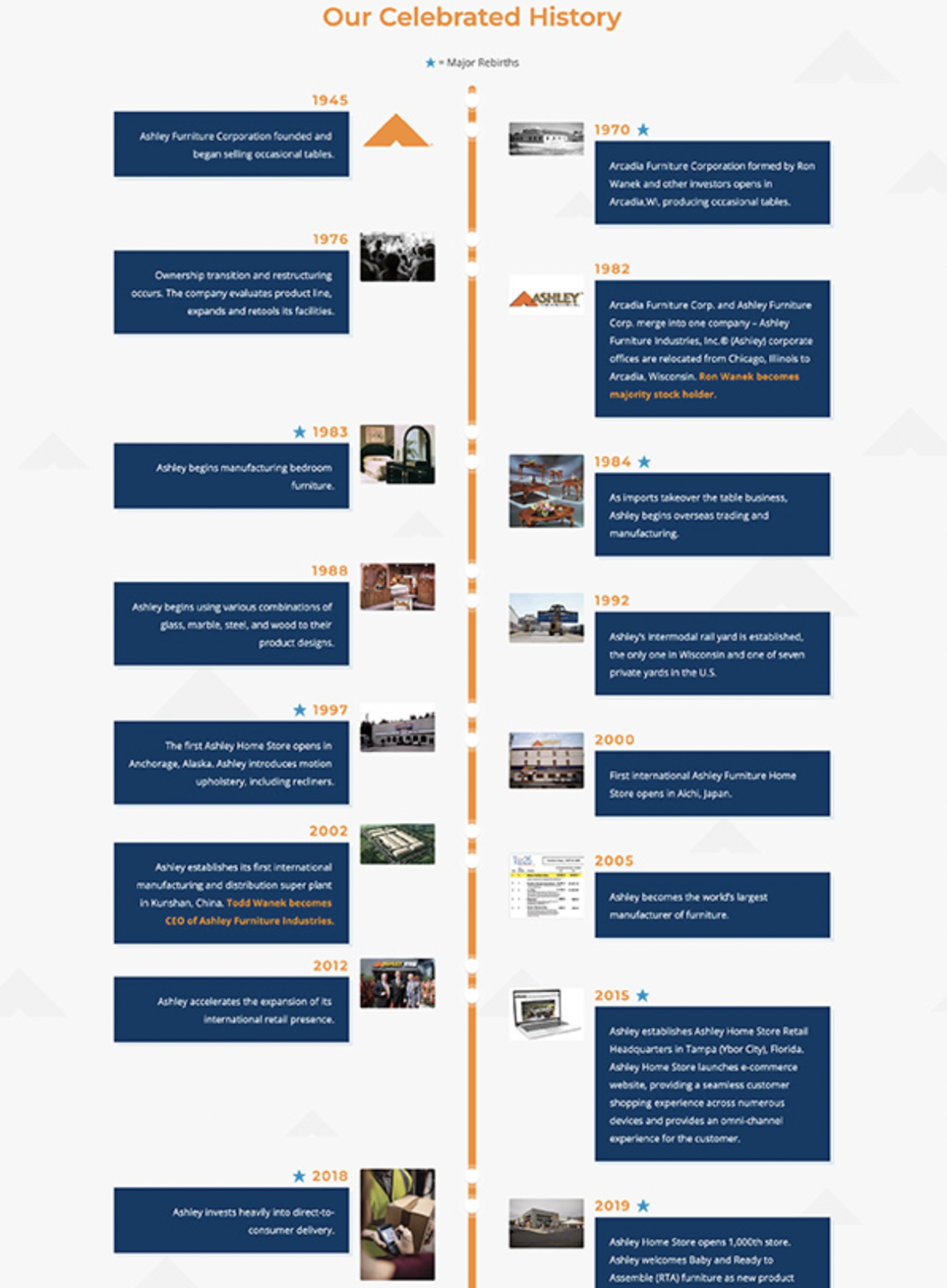
Below is an example from one of Blissbook’s biggest customers, Ashley Furniture:

See how a little timeline goes a long way?
PDFs
With some digital handbook platforms (like Blissbook), you can embed PDFs directly into the content. This is great for detailed information that doesn’t need to be front and center but should still be accessible. For example, embedding policy documents or forms provides employees with direct access to what they need without overwhelming them with details.
Where to Find Images for Your Handbook
Creating an engaging employee handbook often requires a blend of informative content and compelling visuals. As you begin this task, finding the right images that reflect your company’s identity and values can be tough, but there are several places to look.
First, you might already have some awesome pictures lying around! Photos from office parties, snaps of your workspace, or even your company’s branding materials can be perfect. Check with your marketing or design team. They often have photos on hand and ready to use. Just remember: If you’re using photos of employees, make sure they’re okay with it, especially if someone leaves the company later on.
On the other hand, if your company doesn’t have many photos yet, there are plenty of stock photo websites out there. Platforms like Shutterstock, Unsplash, Pexels, and Pixabay are treasure troves of high-quality photos and illustrations. Always double-check licenses and permissions to steer clear of any copyright issues.
Looking for iconography? Try the Noun Project, Flaticon, Iconfinder, or Streamline Icons.
Lastly, if you’ve got the resources, graphic designers can be invaluable. These experts, whether part of your team or external collaborators, can whip up custom visuals that fit your brand perfectly. They can help figure out where a picture might work better than words. Trust them; they know what they’re doing!
Tips on Using Images
When inserting images into your handbook, consider the following best practices:
- Place images strategically – To enhance your handbook’s readability, position your visuals close to their related content. This approach not only makes the content more engaging but also simplifies comprehension.
- Prioritize image quality – High-definition images offer clarity, but be cautious about their file size. Large images can make your document slow to load and can complicate printing (if you’re old school!). Platforms like Blissbook often have guidelines on the best image dimensions — or you can ask their support team for help.
- Add clear captions – While images convey a lot, a well-placed caption can effectively tie everything together. These brief annotations highlight important points and guide readers to the crucial parts of each visual element.
- Keep a consistent style – Using a uniform style throughout your handbook boosts its aesthetic appeal and strengthens your brand identity. If you’re unsure about this, your marketing team’s brand guidelines can be a good starting point.
- Ensure inclusivity with alt text – To make your handbook accessible to all, including those using screen readers or Braille devices, be sure to add alternative text (alt text) for each image. This concise descriptor offers a clear mental picture of the visuals.
These tips help you get the most out of your images.
Design an Engaging Employee Handbook with Blissbook
The right blend of design elements can be instrumental in engaging and connecting your employees from the get-go. It’s common to focus on the content of your handbook, but by paying equal attention to its design, you can make a first impression that’s both impactful and reflective of your company.
If you’re looking for a seamless way to craft and present your handbook, consider using Blissbook. Our intuitive tools, templates, and in-house resources help you write, edit, and design an engaging handbook that resonates with your brand.

Ready to experience a seamless way to craft your online employee handbook? Sign up for a free demo of Blissbook today!